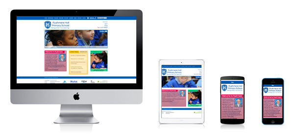
What are responsive school websites?
In 2013, 50% of internet users used their mobile phone primarily to browse the internet.
The growth of the mobile internet has been staggering. Your website is no longer viewed solely by people with desktop computers and big monitors. Small screen users are beginning to dominate internet traffic, and it’s important that your website is tailored to their needs.
Yesterday’s solution: Mobile Websites
In the not too distant past, the best solution to help mobile users view your website was to redirect them to a separate website, tailored for small screens. This meant adding a separate area of your website, with a simplified design (that often didn’t reflect the full website) with different content and less functionality. Slowly as more and more mobile devices appeared, the iPhone, Android devices, Windows Phone, there became too many screen sizes to design for!
Today’s solution: Responsive Websites
Responsive websites adapt the website’s design to any screen width, re-organising layout in order to find the best fit for your screen size. Rotate your iPad? The website will re-factor to make better use of space. It’s the perfect way to deliver the best experience to your users, no matter what device they use.
Here are a few examples of our recent responsive websites from our portfolio:


